|
The exhibition “VENEZIA – Queen of the Seas“.
A satellite exhibition on the relations between Estonia and Venice. Client: Estonian Maritime Museum Location: Seaplane Harbour, Tallinn Date: 25.03–03.09.2023 Curator: Eero Epner Graphic design: Stuudio Stuudio Exhibition architecture: Neeme Külm Prototyping: Kadri Villand Fabrication: Valge Kuup Studio Exhibition views by Anu Vahtra |
Neeme Külm about the design of the exhibition on relations between Estonia and Venice seen through art history – a satellite exhibition to “VENEZIA – Queen of the Seas“.
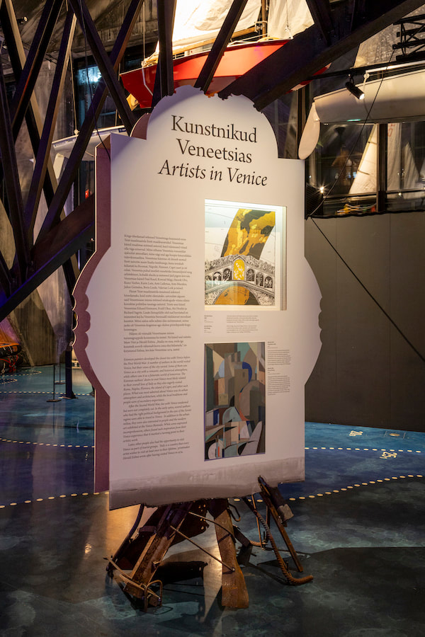
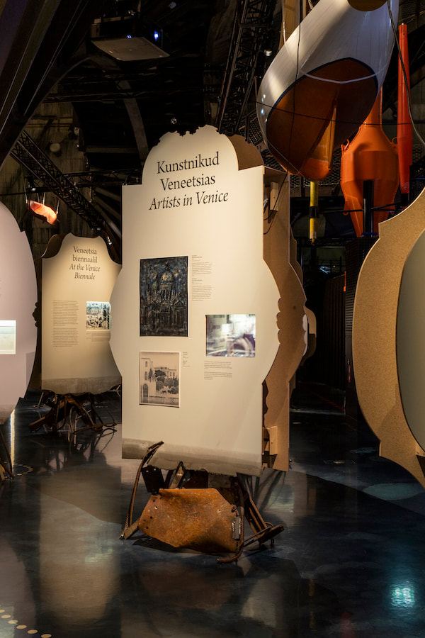
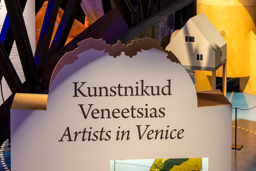
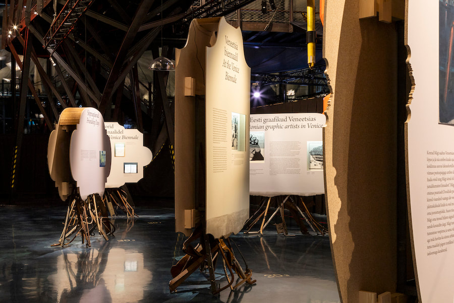
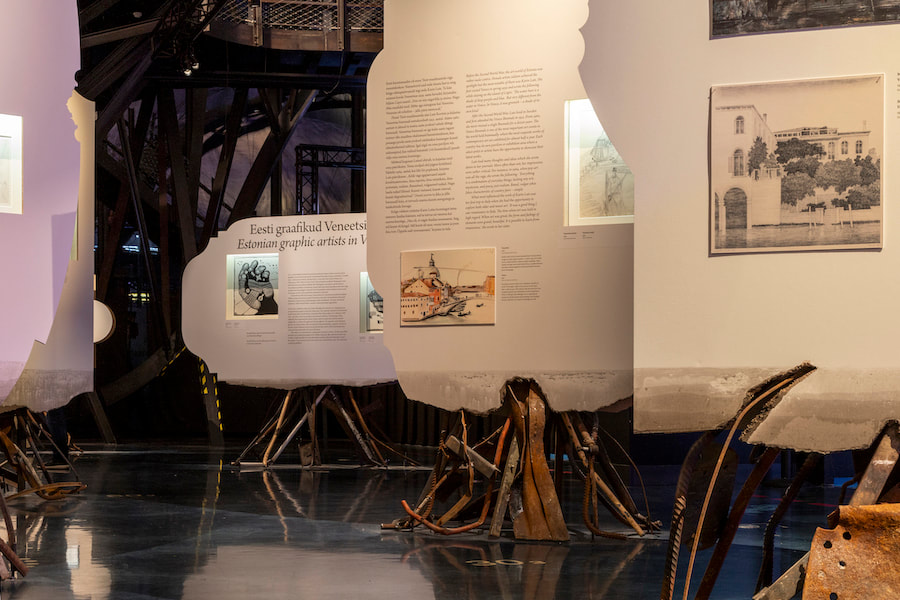
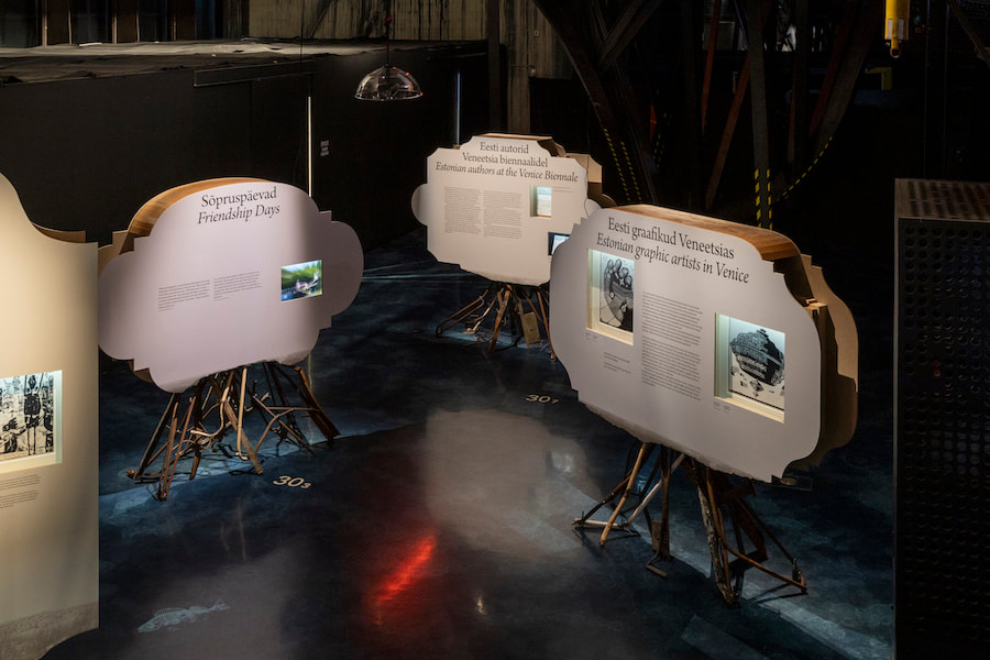
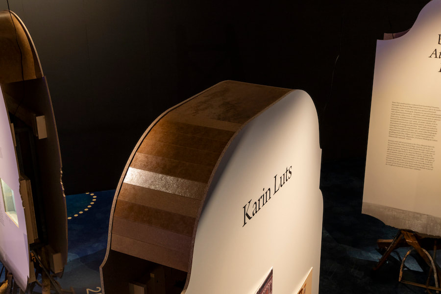
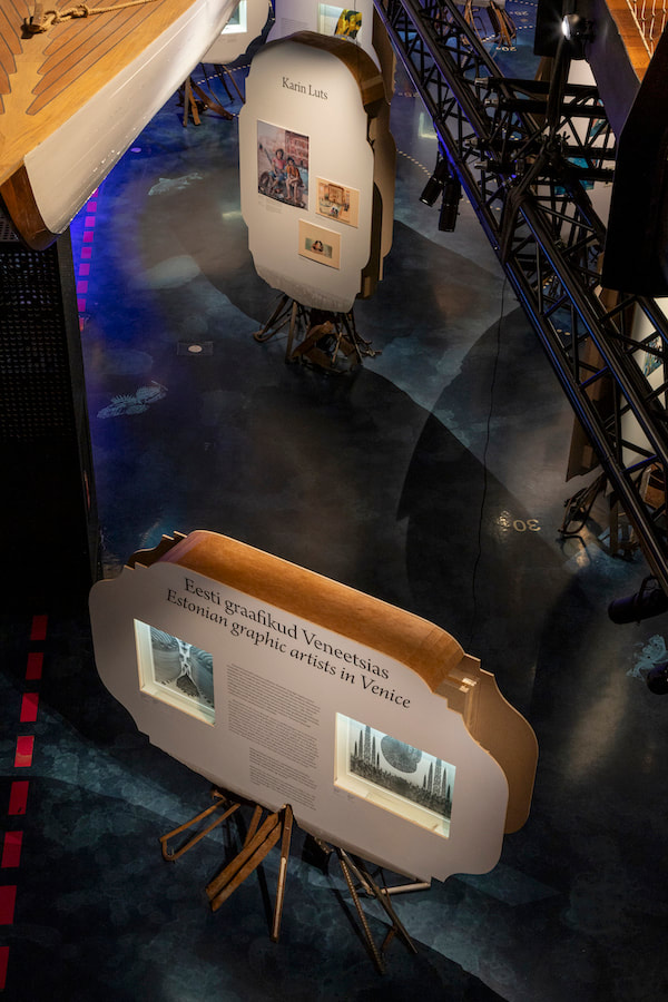
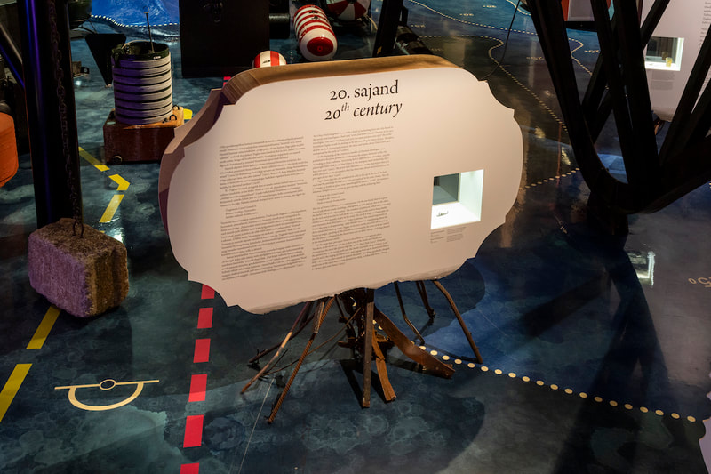
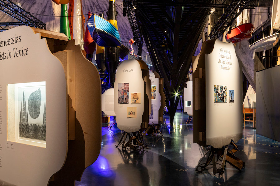
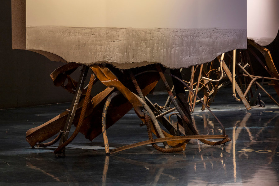
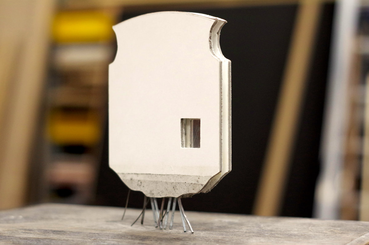
Where does yet another attempt to bring home a piece of that cream cake called Venice get it’s beginning? My connection with this paradoxical city is hidden within dozens of comings and goings. The city embodies joy and sadness, it comprises everything that is contradictory, intensely human, false and honest, it repels and fascinates, more than I can imagine of any city. Incredibly theatrical – in everything! Overabundant gothic and baroque architecture packed into narrow streets. Apparently endless canals that rise and fall with crazy regularity to flood the land, enveloping palaces and squares in its wet embrace. And all of this is accompanied by myths and legends, hordes of tourists, fortune seekers, lovers, migrants, refugees, activists, pigeons and locals. And the cafes and restaurants, the endless number of boutiques, affluence throttling poverty, age and youth. Streets full of doors, balconies, curtains, flowerpots, celebrations, everydayness, laundry and rubbish. Museums mixed up with churches, copies with originals. An abundance of history, art, music, literature and theatre. Now, try to mould this into one exhibition! Right from the start we were aware that throughout history Estonia’s connection with Venice has been sporadic. In this exhibition the connection had to be established through memories, and the few isolated artefacts held in Estonian museums became silent witnesses proving what had taken place. The curators approached this creatively and worked collaboratively with us. The themes of the exhibition could not be presented in a linear narrative, and we were aware that what we wanted to communicate would speak more tacitly to the viewer if it were presented as fragments on separate display panels. Our design concept is like a journal whose pages open out towards the viewer. The order you leaf through them is not important. The aim was not to make an art exhibition. The curator Eero Epner’s way of telling the story perfectly matched the concept and the separately standing display units suited the cathedral-like seaplane hangars of the Maritime Museum like buttons on a jacket and provided extra impetus for the idea. The design’s architectural symbiosis was inspired by the architecture of Venice and the surrounding sea. Since it was known beforehand that the main exhibition would be bold, angular and large in scale, then the Estonian section was intentionally reserved, and aimed to be beautifully subdued, but not subservient. There is no history without people. The intention was to make the Estonian exhibition personal – reflecting the experience of Estonians. Each of the display units had its own look and was intentionally designed to have a handicraft feel, a handmade feel. The two-sided units stood on a metal structure and were reminiscent of the legs of a squid, and like old, rusted metal that has drifted ashore. The material was collected from a pile of scrap metal at the end of the Kopli peninsula in Tallinn. To ensure the ‘tentacles’ looked as random and unique as possible the legs were welded together by metalwork students at Kopli vocational school. The lower edge of each unit has tide marks hence making reference to the location of the city of Venice between the sea and the land. This design made it possible to create the illusion that the units weren’t resting on the ground but floating in water. The display panels attached to the legs were like cut-outs from Venetian architecture. The shape of each unit made a direct connection with the palazzos of Venice. They were based on architectural details of ceiling painting recesses in gothic and baroque buildings – evidence of the richness of Italian architecture. To get a sense of proportions, visuals and amount of text for each display unit and also their stability we experimented at the Valge Kuup studio with all possible proportions and placements using a prototype created by Kadri Villand. With graphic designers from Stuudio Stuudio we found a solution where each block of text was placed off- centre and the panels were painted in a barely noticeable undertone. The surfaces had recesses and alcoves for the placement of artefacts. Each unit took into account the exhibition requirements of each item and the viewing comfort of visitors. We knew that during the exhibition the artefacts had to be changed, so we had to consider the museums’ instructions for each item separately. Profuse lighting was not an option, so each artefact had its own individual lighting solution. The overall design had an intentionally unfinished look. I wanted it to be reminiscent of buildings under construction or behind-the- scenes stage decorations, to give a sense that behind the facades there are hidden human tragedies and confirm the fantasy that everything is human and personal, and nothing is final. |
